library(ggplot2)library(dplyr)theme_set(theme_minimal(base_size = 24))
t <- tibble(a = c("A", "B", "C"),            b = c(100, 200, 280))t
Output:
# A tibble: 3 × 2
a b
<chr> <dbl>
1 A 100
2 B 200
3 C 280
This article graphically illustrates the association when a linear Cartesian ordinate and a polar coordinate. An intuitive knowledge of such association will greatly help the creation of pie and donut charts.
library(ggplot2)library(dplyr)theme_set(theme_minimal(base_size = 24))
t <- tibble(a = c("A", "B", "C"), b = c(100, 200, 280))tOutput:
# A tibble: 3 × 2
a b
<chr> <dbl>
1 A 100
2 B 200
3 C 280
base <- t %>%   ggplot(aes(x = 1, y = b, fill = a)) +  theme(legend.position = "none") +  scale_fill_brewer(palette = "Set2")
p <- base + geom_col(color = "black") p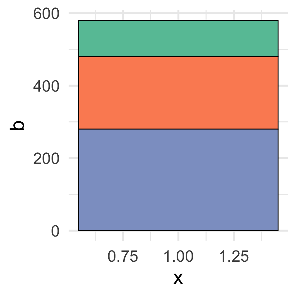

theta = "x" transforms the x aesthetic from the linear coordinate into angles in a polar coordinate, and generates the bullseye plot or other formats (see creative examples here and here). In contrast, theta = "y" transforms the y aesthetic into angles, and creates the typical pie and donut plots (see great examples here and here).
p + coord_polar(theta = "x")p + coord_polar(theta = "y")

As the pie and donut plots are much more commonly used, we will focus on the theta = "y"-based transformation in the rest of this article.
A thick white outline in the bars generates the exploding effect in the pie.
x <- base + geom_col(color = "white", linewidth = 5) xx + coord_polar(theta = "y")

Add texts. Use the stack position with center-alignment vjust = .5 to synchronize the texts with the associated bars. This correspondingly puts the texts in the “center” position of each slice in the pie plot.
p1 <- p + geom_text( aes(label = a), position = position_stack(vjust = .5), fontface = "bold", size = 12)p1p1 + coord_polar(theta = "y")

Shift texts upward or downward with vjust. This correspondingly changes the rotating angle of the texts in the pie slices.
p2 <- p + geom_text( aes(label = a), position = position_stack(vjust = 1), fontface = "bold", size = 12)p2p2 + coord_polar(theta = "y")

Adjust the text x aesthetic to shift texts to the left or right. This correspondingly changes the radial distance between the texts and the center of the pie.
p3 <- p + geom_text( aes(label = a, x = 1.6), position = position_stack(vjust = .5), fontface = "bold", size = 12)p3p3 + coord_polar(theta = "y")

Extend the lower limit on the x-axis in the bar plot. The space on the left of the bar will be transformed into a central whole in the donut plot. The x-axis upper limit, set as NA, extends automatically to the maximum of the data (i.e., the right edge of the bar).
p4 <- p1 +   scale_x_continuous(limits = c(0, NA))
p4p4 + coord_polar(theta = "y")

A smaller value of the lower limit (e.g., -10) on the x-axis generates more white space of the left side of the bar. This generates a narrower bar plot, and corresponds to a thinner donut plot in a polar coordinate. In like manner, a larger upper limit (e.g., 10) on the x-axis creates more space on the right side of the bar. Correspondingly, this introduces more space on the external side of the donut, and compresses it into a smaller circle.
p5 <- p1 + coord_polar(theta = "y")
# a thin donutp5 + scale_x_continuous(limits = c(-10, NA)) # a thinner donutp5 + scale_x_continuous(limits = c(-10, 10)) 

A graphical object on the left side of the barplot in a linear coordinate will be positioned at the center of the donut plot in a polar coordinate.
p6 <- p4 + annotate(geom = "text", label = "XXX", x = 0, y = 400, size = 10, fontface = "bold")p6 p6 + coord_polar(theta = "y") 

Adding a negative vjust value in the position argument of geom_col() generate extra space in the negative range of the y axis. This correspondingly generates a partial pie.
p7 <- base +   geom_col(position = position_stack(vjust = -1)) +  geom_text(    aes(label = a),     position = position_stack(vjust = .5),    size = 10, fontface = "bold")
p7p7 + coord_polar(theta = "y") 

Rotate the pie to a balanced orientation. The start argument specifies the amount of rotation, and can take a bit of trial-and-error to find a suitable value. On top of this, extension of the lower limit of the x-axis further turns the halved pie into a halved donut (a dashboard plot).
p8 <- p7 + coord_polar(theta = "y", direction = 1, # turn clockwise start = 2.15) # amount of offset from 12 o'lockp8p8 + scale_x_continuous(limits = c(0, NA))

Now let’s check the polar transformations with faceted panels.
t2 <- tibble(a = rep(c("A", "B", "C"), time = 2),             b = c(100, 200, 300, 50, 400, 800),             m = rep(c("α", "β"), each = 3))
p9 <- t2 %>%   ggplot(aes(1, b, fill = a)) +   facet_wrap(~m) +  theme(legend.position = "none") +  scale_fill_brewer(palette = "Set2")
The bar height is proportionally mapped to the angle of the pies based on the same scaling factor across all panels. As a result, differences in the total height of the bars in the faceted panels would result in fractional pies in the polar coordinate.
p9 + geom_col()
p9 + geom_col() + coord_polar(theta = "y")
To get pies with the entirety of 360° degree, an easy approach is to normalize the bar height to the scale of [0, 1] for each panel by specifying the fill position.
p9 + geom_col(position = "fill")
p9 + geom_col(position = "fill") + coord_polar(theta = "y") 
The texts can take the same fill position to be aligned with the stacked bars / pies.
p10 <- p9 + geom_col(position = "fill") +  geom_text(    aes(label = a),    position = position_fill(vjust = .5),    size = 8, fontface = "bold")
p10p10 + coord_polar(theta = "y") 
Check these exploded donut plots in faceted layout that visualizes the GDP contribution proportion of the top 4 countries separately in each continent.

Check the following exploded donut plots in a U.S. map layout that visualizes the state-wise voting results of the 2016 Presidential Election between Hillary Clinton and Donald Trump .


