library(ggplot2)library(dplyr)
# default themetheme_set( theme_bw(base_size = 14) + theme( axis.text = element_text(color = "red3", face = "bold")))Seven Tips to Deal with Overcrowded Text Labels
A graphic can be often plagued with crammed text labels. In this tutorial, we’ll discuss 7 great methods to deal with this common issue in data visualization.
- Case 1: Too many densely packed labels. (Methods 1 ~ 4)
- Case 2: Long text strings. (Methods 5 ~ 6)
- Case 3: Crowded scatterplot of texts (Method 7)
Packages and global theme
Case 1: Too many densely packed labels
In the bar chart displayed below, the x-axis labels are densely packed and overlapping, making it difficult to read. Methods 1 ~ 4 come in handy to address this situation.
a <- mpg %>% ggplot(aes(x = manufacturer)) + geom_bar(fill = "grey80")a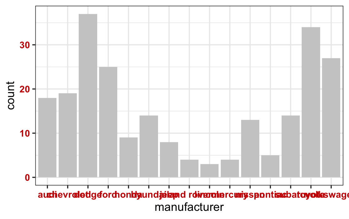
Method 1: Swap the x and y axis
a + coord_flip()
Note that with coord_flip(), the rule of aesthetic mapping is not changed: the manufacturer variable remains the x aesthetic (left vertical axis), and the count variable remains the y aesthetic (bottom horizontal axis). In the theme() syntax, however, the horizontal axis is always treated as the x-axis, and the vertical axis as the y-axis.
Method 2: Tilt the axis labels
Note that the text is horizontally justified to the right with hjust = 1.
a + theme(axis.text.x = element_text(angle = 60, hjust = 1))
The guides() syntax can be used to render the same graphical effect.
# the text is automatically justified to the right a + guides(x = guide_axis(angle = 60)) The code above is equivalent to the following one:
a + scale_x_discrete(guide = guide_axis(angle = 60))Method 3: Stagger the axis labels
a + guides(x = guide_axis(n.dodge = 2))
Method 4: Abbreviate the labels.
a + scale_x_discrete(labels = abbreviate)
Case 2: Long text strings
In the scatterplot displayed below, each x-axis label is composed of multiple words. The long strings overlap with each other and are difficult to read.
course <- c(  "Environmental science and policy",   "Global economic issues",   "Introduction to ggplot2 visualization",   "Introduction to psychology",   "Quantum mechanics fundamentals")scores = c(78, 90, 100, 87, 90)
t <- tibble(course = course, scores = scores)
b <- ggplot(t, aes(course, scores)) +   geom_point(size = 10, alpha = .2)b
You can use methods 5-6 to wrap texts to avoid/reduce text overlap. Check this article for a systematic summary of text wrapping techniques.
Method 5: Wrap axis labels with the scales package
Use the label_wrap() function from the popular scales package to wrap long strings of axial labels. The width argument specifies the maximum number of characters in each line.
library(scales)b + scale_x_discrete(labels = label_wrap(width = 15)) 
Method 6: Wrap texts with the stringr pakcage.
The stringr is a popular package for string manipulation. The function str_wrap() is a more flexibly way to wrap texts in ggplot2. The width argument specifies the maximum number of characters in each line.
library(stringr)b + scale_x_discrete( labels = function(x)str_wrap(x, width = 10)) 
Case 3: Crowded scatterplot of texts
Consider the following scatterplot of texts with much overlap.
m <- mtcars %>%   mutate(cars = rownames(mtcars)) %>%   ggplot(aes(mpg, qsec, label = cars))
m + geom_text()
In addition to techniques like text wrapping illustrated above, some approaches used to visualize overcrowded scatterplots (check here) can be also useful. On top of these, method 7 is a special tool to address overlapped scatter-texts.
Method 7: Use ggrepel package to fine-tune the text position for minimal overlap.
library(ggrepel)
m + geom_text_repel(  # reduce the padding space around the text to zero  box.padding = unit(0, units = "pt"),     # Always show all texts despite potential overlap  # by default, some texts will NOT be shown if there are too many texts  max.overlaps = Inf)
Use colors to help distinguish the labels. And add points to display the original position of each data point.
m + geom_text_repel(aes(color = cars), box.padding = unit(0, units = "pt"), max.overlaps = Inf) + # add points to display the actual position geom_point(aes(color = cars, fill = cars), shape = 21, color = "black") + # remove the legend theme(legend.position = "none")

