Reorder Violin Plots by Summary Statistics in ggplot2
From the prior learning, you have mastered four distinct approaches to reorder a bar plot. In this tutorial, you’ll elevate your skills to a higher level - reorder the graphics based on summary statistics:
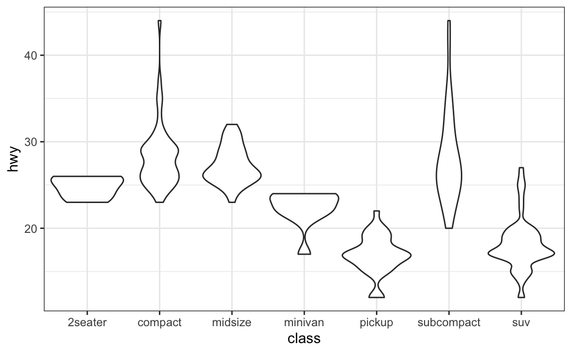
You’ll use the mpg dataset from the ggplot2 package, and create violin plots to display the highway mileage per gallon (hwy) of different class (class) of cars. You’ll reorder the violin plots based on different statistics (e.g., mean and standard deviation) of the hwy variable.
# packages and global themelibrary(ggplot2)library(dplyr)theme_set(theme_bw()) head(mpg, n =4)
Output:
# A tibble: 4 × 11 manufacturer model displ year cyl trans drv cty hwy fl class <chr> <chr> <dbl> <int> <int> <chr> <chr> <int> <int> <chr> <chr> 1 audi a4 1.8 1999 4 auto(l5) f 18 29 p compa… 2 audi a4 1.8 1999 4 manual(m5) f 21 29 p compa… 3 audi a4 2 2008 4 manual(m6) f 20 31 p compa… 4 audi a4 2 2008 4 auto(av) f 21 30 p compa…
The default violin plots are arranged in the alphabetical order of the class names of the cars.
Reorder violins by the average of mileage per gallon
You’ll rearrange the violin plots (the class variable) based on the average of mileage per gallon (the hwy variable). You’ll complete this via two approaches: the dplyr way, and the forcats way.
Rearrange the violins via the dplyr approach.
# Arrange the rows based on the mean of 'hwy' of each 'class'mpg.arranged <- mpg %>%group_by(class) %>%mutate(hwy.mean =mean(hwy)) %>%arrange(hwy.mean) # Extract distinct levels while retaining the rearranged orderclass.ordered <-unique(mpg.arranged$class) # Convert 'class' to factor to memorize current rearranged order# there should be NO duplicated values for the 'levels' argumentmpg.reordered <- mpg.arranged %>%mutate(class =factor(class, levels = class.ordered)) # Plotmpg.reordered %>%ggplot(aes(class, hwy)) +geom_violin(width =1)
Rearrange the violins via the forcats approach.
Use the fct_reorder() function from the forcats package to reorder the levels of the class variable based on the associated hwy values. Use .fun = mean to specify the reordering to be based on the average in each categorical level (group) of the class variable. By default, the ordering is based on the median. Note that there are no parentheses following the function name for the .fun argument.
You can quickly display the average in each violin plot at the same time using stat_summary() with fun = mean. (Check out more techniques to rapidly visualize group statistics)
library(forcats) mpg %>%mutate(class =fct_reorder(class, hwy, .fun = mean)) %>%ggplot(aes(class, hwy)) +geom_violin(width =1) +# display the mean of each violinstat_summary(fun = mean, size =1, color ="turquoise4")
As you could see, the forcats package offers a much faster approach than the dplyr way to reorder the violin plots. We’ll keep using the forcats method in the following discussion.
Reorder by the standard deviation of mileage per gallon
Alternatively, you can reorder the violins based on the standard deviation (via function sd()) in each class of the car. Use stat_summary() and fun.data = mean_sdl to simultaneously display the mean and standard deviation (check here to learn more about stat_summary()).
mpg %>%mutate(class =fct_reorder(class, hwy, .fun = sd)) %>%ggplot(aes(class, hwy)) +geom_violin(width =1) +# display the mean and standard deviation of each violin plotstat_summary(fun.data = mean_sdl, color ="coral",size =1, linewidth =1.5)
Reorder by the observation number in each car class