We’ll work on the famous gapminder dataset. It shows the life expectancy (lifeExp), population (pop), and GDP per capita (gdpPercap) in countries from different continents in every 5 years from 1950s to 2000s. 🌎
# A tibble: 4 × 6 country continent year lifeExp pop gdpPercap <fct> <fct> <int> <dbl> <int> <dbl> 1 Afghanistan Asia 1952 28.8 8425333 779. 2 Afghanistan Asia 1957 30.3 9240934 821. 3 Afghanistan Asia 1962 32.0 10267083 853. 4 Afghanistan Asia 1967 34.0 11537966 836.
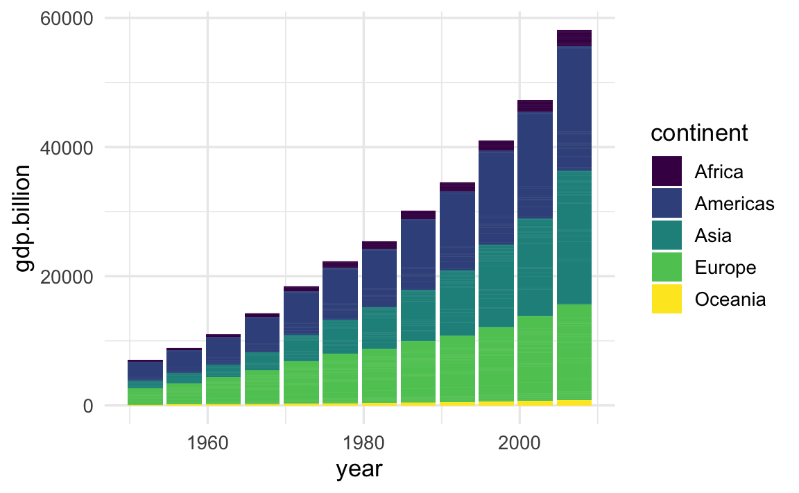
Draw bars to visualize the total GDP in each continent
Calculate the GDP (in billions) per year in each country as the product of population size and GDP per capita.
g <- gapminder %>%mutate(gdp.billion = pop * gdpPercap /10^9)
Create bars to visualize the total GDP in each continent during each year.
At each year, bars of different countries are stacked up by default.
By the aesthetic mapping of fill = continent, countries of the same continent have the same fill and are grouped together, visually depicting the total GDP of the associated continent.
The continents are arranged in the default alphabetical order.
# create a stacked bar plotg %>%ggplot(aes(year, gdp.billion, fill = continent)) +geom_col() +scale_fill_viridis_d()
Reorder the stacking of bars based on continent GDP
Let’s say we want to put continents with large GDPs at the bottom of the bar plot, and continents with smaller GDPs at the top. In the fct_reorder() function, .fun = sum calculates the sum of GDP across all countries and all years separately for each continent, and these continent-wise sums determines the continent stacking order.
g_reordered_continent <- g %>%mutate(continent =fct_reorder( continent, gdp.billion, .fun = sum)) g_reordered_continent %>%# ggplot2 part is the same as beforeggplot(aes(year, gdp.billion, fill = continent)) +geom_col() +scale_fill_viridis_d()
Convert the bar plot to area / ribbons plot
The bar plot can be easily converted to an area / ribbon plot by switching geom_col() to geom_area() with an additional aesthetic mapping aes(group = country), so that data points of the same country are connected across the x-axis to form a continuous ribbon. Due to this group aesthetic, however, countries of the same continent are no longer bundled together.
g_reordered_continent %>%ggplot(aes(year, gdp.billion, fill = continent)) +geom_area(aes(group = country)) +scale_fill_viridis_d()
Cluster ribbons of countries in the same continent
Apply arrange() to reorder rows by continent, and use factor() to turn country into a factor variable with levels being the current appearance order in the reordered dataset. As each country level is duplicated in multiple rows (corresponding to different years), unique() is used to extract distinct country names.
g_reordered_continent_country <-# cluster countries in the same continent g_reordered_continent %>%arrange(continent) %>%mutate(country =factor(country, levels =unique(country))) g_reordered_continent_country %>%# The ggplot2 part is the same as aboveggplot(aes(year, gdp.billion, fill = continent)) +geom_area(aes(group = country)) +scale_fill_viridis_d()
Apply Your Learning in Practice! 🏆
The following stacked ribbon / alluvium plot shows dynamic shifts in the migrant population to the United States from 1820 to 2009. In this plot, countries are reordered such that those from the same continent are clustered together. This enables the use of color gradient to distinguish both countries and continents.