# packages and global themelibrary(ggplot2)library(dplyr)theme_set( theme_minimal() + theme( plot.title = element_text(color = "turquoise4")))Wrap Long Texts in ggplot2 with 4 Distinct Approaches
In this article, we’ll discuss how to wrap texts. First, we’ll talk about how to wrap long plot titles using three distinct approaches. Lastly, we’ll take a special look at how to quickly wrap axial labels using a fourth solution.
The title in the following scatterplot extends beyond the plot boundary, and is not displayed completely. Below we’ll discuss three distinct approaches to deal with this situation.
myTitle <- c(  "The Iris flower data set or Fisher's Iris data set is a multivariate data set used and made famous by the British statistician and biologist Ronald Fisher in his 1936 paper on the use of multiple measurements in taxonomic problems as an example of linear discriminant analysis.")
a <- iris %>%   ggplot(aes(Sepal.Length, Sepal.Width)) +  geom_point(alpha = .2, size = 6)
a + ggtitle(myTitle)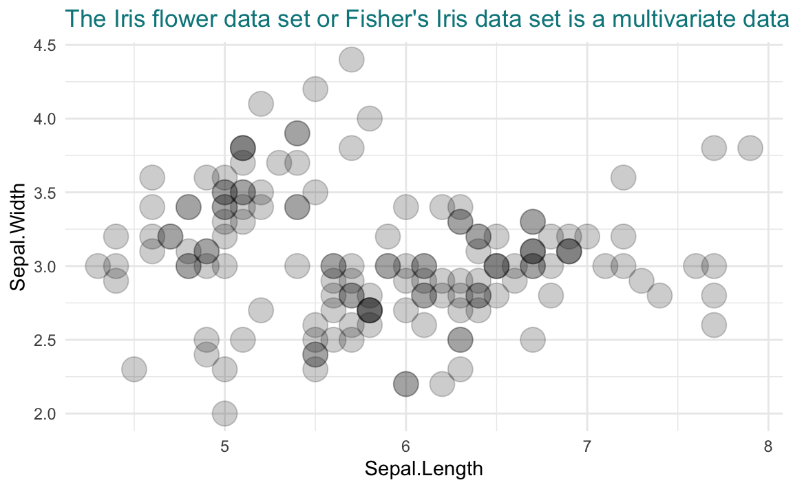
Method 1: Manually insert line breaks in the title script
Simply type the Enter key (in Windows) or return (in Mac) to break the lines in the script of the title string. This not only introduces visible line breaks in the rendered graphic, but also makes the script more readable (see plot title 1st line).
Alternatively, insert
\nin the string anywhere desired to make a line break. A\nin the middle of a script line shifts following texts to a new line; a\nat the end of a script line introduces an empty line (see plot title 3rd empty line).The line breaker
<br>in HTML will be interpreted literally, and does not work to make a line break in this context (see plot title 4th line).Techniques above will behave differently when
ggtextis used (see method 3).
myTitle_2 <- c(  "The Iris flower dataset is a multivariate data set used  and made famous by the British statistician and biologist\n  Ronald Fisher in his 1936 paper on the <br><br> use of  multiple measurements in taxonomic problems    as an example of linear discriminant analysis.")
a + ggtitle(myTitle_2)
Method 2: Use str_wrap() from the stringr package.
Here we demonstrate using the original title myTitle, which does not contain any line breaker. We use str_wrap() for automatic text wrapping. The width argument specifies the maximum number of characters in each line.
library(stringr)a + ggtitle(str_wrap(myTitle, width = 50))
Method 3: Format the title with ggtext package
ggtext is a very useful package that formats a selected piece of texts regarding their font, color, size, bold and italics, sub- or superscript. Its use involves two steps:
(1) Use HTML markup language in the title string.
In the context of
ggtext, you can break the lines in the script by typing the Enter key (in Windows) or return (in Mac), but without the line breaks displayed in the rendered graphic.To make a line break in the rendered graphic, add the HTML tag
<br>anywhere desired (see 1st, 2nd, and 4th line in plot title). Alternatively, type two white spaces at the end of each line to make a line break. Or use\nat the end of each line to start a new paragraph with larger line break margin (see 4th line in plot title).The aforementioned
str_wrap()function is not effective in theggtextcontext.
(2) In the theme() function, use element_markdown() in place of element_text().
library(ggtext)
myTitle_3 <- c(  "The Iris flower dataset <br> is a multivariate dataset   used and made famous by the British <br> statistician   and biologist Ronald Fisher in his 1936 paper\n  on the use of multiple measurements in taxonomic problems <br> as   an example of linear discriminant analysis.")
a + ggtitle(myTitle_3) +  theme(plot.title = element_markdown())
You can also use element_textbox_simple() to wrap texts automatically. Here we demonstrate using the original myTitle which does not contain any manually added line breaker.
a + ggtitle(myTitle) + theme(plot.title = element_textbox_simple( # increase the margin on top and bottom of the title margin = margin(t = 10, b = 10, unit = "pt") ))
Method 4: Wrap axial labels with the scales package
The x-axis labels in the following scatterplot is greatly overlapped. Wrapping the labels is a great way to improve readability. (Check out additional approaches to address overcrowded axis labels)
course <- c(  "Environmental science and policy", "Global economic issues",   "Introduction to ggplot2 visualization", "Introduction to psychology",   "Quantum mechanics fundamentals")scores = c(78, 90, 100, 87, 90)
t <- tibble(course = course, scores = scores)
b <- ggplot(t, aes(course, scores)) +   geom_point(size = 10, alpha = .2) +  theme(axis.text.x = element_text(color = "turquoise4", face = "bold"))b
The label_wrap() function from the popular scales package offers a quick solution to wrap axial labels. The width argument specifies the maximum number of characters in each line.
library(scales)b + scale_x_discrete(labels = label_wrap(width = 15)) 
Alternatively, we can achieve the same effect using the aforementioned str_wrap() function from the stringr package, yet with a slightly different syntax.
library(stringr)b + scale_x_discrete(labels = function(x){str_wrap(x, 15)}) 
