Five Awesome Tips to Deal with Overlapped Error Bars
In this tutorial, we’ll talk about five powerful solutions to better visualize overlapped error bars.
Create a dummy example
library(ggplot2)library(dplyr)theme_set(theme_bw(base_size =16) )set.seed(123) # for reproducible randomization # set the x valuesn <-6x <-1:n# set the y values, corresponding to two categoriesy1 <- x ^.1y2 <- x ^.2# set standard deviation SDSD <-runif(2*n, min = .1, max = .2) # Create a data framemydata <-data.frame(x =c(x, x), y =c(y1, y2), SD = SD, category =rep(c("A", "B"), each = n)) head(mydata, n =3)
Output:  x        y        SD category
1 1 1.000000 0.1287578        A
2 2 1.071773 0.1788305        A
3 3 1.116123 0.1408977        A
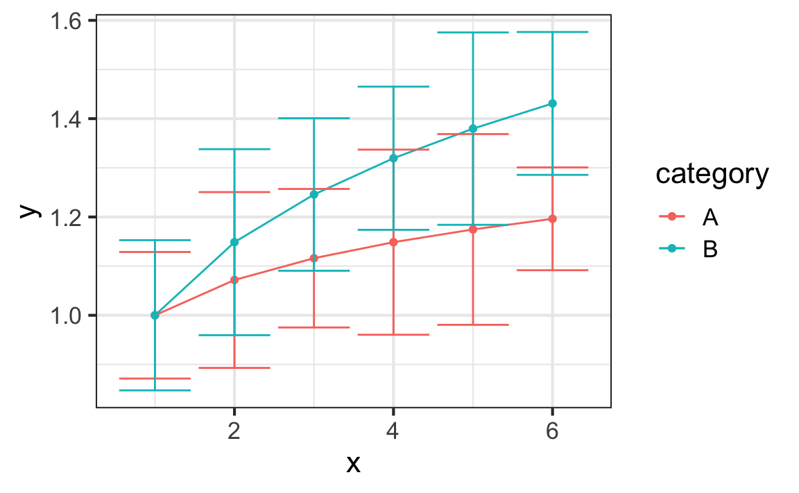
p <- mydata %>%ggplot(aes(x, y, color = category)) p +geom_point() +geom_line() +geom_errorbar(aes(ymin = y + SD, ymax = y - SD))
Method 1: Draw error bars in half
Use the ifelse() function in the aesthetic mapping to help create halved error bars.
p +geom_point() +geom_line() +geom_errorbar(aes(ymin =ifelse(category =="A", y - SD, y), ymax =ifelse(category =="A", y, y + SD)))
To remove the error cap connected to the lines, one trick is to reduce the cap width, and overlay with points of larger size.
p +geom_line() +geom_errorbar(aes(ymin =ifelse(category =="A", y - SD, y), ymax =ifelse(category =="A", y, y + SD)),width = .2) +# reduce cap widthgeom_point(size =4)
geom_pointrange() is very similar to geom_errorbar(), but does not draw the cap at the end of the error bar. The size of the point is controlled by the size argument (yet on a different size scale from the regular geom_point()), and the line thickness is controlled separately by linewidth.
p +geom_line() +geom_pointrange(aes(ymin =ifelse(category =="A", y - SD, y), ymax =ifelse(category =="A", y, y + SD)),size =1, # for pointlinewidth =1) # for error bar
Method 2: Stagger error bars with position in dodge
Applying the dodge position to stagger the error bars (and other geometrics) is a very effective approach to reduce overlap. All three geometric layers should be dodged with the same width to be synchronized in position.
p +geom_point(position =position_dodge(width = .3)) +geom_line(position =position_dodge(width = .3)) +geom_errorbar(aes(ymin = y + SD, ymax = y - SD),position =position_dodge(width = .3))
Method 3: Draw error ribbons in place of error bars
When there are too many error bars, using the error ribbons can be a visually cleaner alternative. The argument color = NA removes the ribbon outline.
p +geom_point() +geom_line() +geom_ribbon(aes(ymin = y + SD, ymax = y - SD, fill = category),alpha = .2, color =NA)
Check these two great illustrations (plot 1, plot 2) to quickly generate error ribbons (standard deviation, standard error of the mean, confidence interval) on the fly using the stat_summary() function.
Method 4: Facet the plot into subplots
When the dataset is large enough, faceting the graphic into subplots can be very useful. Here we demonstrate with the base R dataset ChickWeight, which shows the changing weight of each individual chick on different diets across different time points.
slice_sample(ChickWeight, n =4) # display 4 random rows
Visualize the average weight of chicken at different time points on different diets, and create ribbons spanning one standard deviation above and below the mean using stat_summary().
w <- ChickWeight %>%ggplot(aes(Time, weight, color = Diet, fill = Diet)) +stat_summary(geom ="line", fun = mean, linewidth =1) +stat_summary(geom ="ribbon", # mean, with standard deviation limits (sdl)fun.data = mean_sdl, # mean ± 1 × sdl. By default, 2 × sd is displayed fun.args =list(mult =1),alpha = .4, color =NA)w
w +facet_wrap(~Diet, nrow =1)
Method 5: Employ interativity by the ggiraph package
ggiraph is a powerful ggplot2 extension package to create interactive visualization. Here we use it to highlight the hovered group of data and dim out the other data at the same time.
An interactive geom_* is typically created by adding the suffix “interactive” after a regular geom name, e.g., geom_ribbon_interactive. However, in the special case of stat_summary(), we need to add the GeomInteractive prefix before the geom name; as it is not an exported subject from the package, it needs to explicitly extracted from the package using :::.
library(ggiraph) CW <- ChickWeight %>%ggplot(aes( Time, weight, color = Diet, fill = Diet, # When hovered:# 1. show all graphical elements associated with the same "Diet"data_id = Diet, # 2. text in the "Diet" column is displayed in the tooltiptooltip =paste("This is Diet #", Diet)) ) +# trend linestat_summary(geom = ggiraph:::GeomInteractiveLine, fun = mean, linewidth =1) +# error ribbonstat_summary(geom = ggiraph:::GeomInteractiveRibbon,fun.data = mean_sdl, fun.args =list(mult =1),alpha = .5, color =NA) CW
CW by this step is the same static plot as w shown above. To render it interactive is as simple as calling girafe(ggobj = CW). For better readability, the following script highlights the hovered ribbon and dims out the others.
girafe(ggobj = CW, options =list(opts_hover(css =girafe_css(# For hovered ribbon, use same color as in static plot# instead of using the default color in orangecss ="opacity:1;", ) ),# dim out non-hovered elements into high transparencyopts_hover_inv(css ="opacity:.2;" ) ))